We Are a DESIGN Studio, Part II: Manifesto
- Jun 8, 2018
- 6 min read
This month we are looking closely at some of the visual designing we have done recently, our design process, and how our company culture contributes to dynamic designs that work for our clients, and their customers.

Chapter 2: Our Design Manifesto
In the two years of soul-searching and internal research that led to our relaunch, we looked at what we, as designers, felt the world of product, packaging and brand design were missing in the Czech Republic and similar countries in our region.

We not only looked at technical elements, such as graphic style and the limited visual language being utilised in much of commercial design, but we also listened to our hearts and intuition. We put ourselves in the shoes of our clients’ customers, and began formulating solutions.
Now, we understand that rude words, (such as in the picture below), can turn certain people off. But please suspend judgement long enough for us to explain:

True creativity is complex, but one thing common to truly creative people is knowing when to listen to criticism, and—when that criticism is an attempt to strangle a good out-of-the-box idea—when to ignore it. A more crude way to say this is, “We give a fuck, but we don’t give a fuck.”
We do not use this rude word carelessly. In this case, after much discussion, we felt it was the necessary spark to wake people up to the extreme importance of design. It communicates how dedicated we are to taking the calculated risks that will pay off for our clients, their customers, and the planet.
This punk attitude gives us the freedom to offer design directions that no other studios are offering.

As a female-led company we dug into the research that shows that women influence up to 91% of purchasing decisions for the home, and that products designed by and for women are very often more popular with men as well.

What we feel is missing in much of commercial design is heart, empathy, emotion, and compassion, and new visual ideas! The world is in pain. Companies that help ease that pain, will not only be doing good, but will be loved and rewarded by customers. And there needs to be an exciting new visual language for this.

From the lights, to what is on the shelves, to the shelves themselves, good design is often absent and stores are still often soulless and visually unfriendly places.
Why are so many outlets, supermarkets and stores, especially in the food and household goods industries, still so visually unfriendly and often soulless places?

(Above) Store design at a packageless store in Scandinavia. (Below) Prototype of our packageless retail design for Tierra Verde's Yellow & Blue brand.

We live in a designed world. We are surrounded by design from the moment we open our eyes in the morning until we close them at night, and our dreams reflect the designed world we move through during the day.

Whether we are aware of it or not, what we see all day long affects us deeply, our moods, energy, productivity and our levels of happiness. From architecture, to furniture, to the products we buy. Not paying attention to this is extremely short-sighted, no matter what business you are in.

Unfortunately, it is still often a few businessmen and politicians who are stuck in the single-bottom-line thinking patterns of the 20th Century that are responsible for the “design” of the world that affects us 24 hours a day, not trained designers.

We live with the products we buy. They are in our homes and they appear in our dreams. Yet the visual language of so many of these products screams one thing, “BUY ME!”, at eyes that have been staring a computer screens and advertising all day every day.

The visual language at work in these common designs lacks empathy and compassion. Even the language used in these designs is aggressive.
In 20th Century thinking, screaming “Buy Me!” was considered “good” business, as it moved product. But now, deep into the 21st Century, with the rising awareness that we have all been seen only as targets and have been manipulated, customer-centricity is of ultimate importance for continued growth. In this new understandings of the brand relationship—wherein people need to know that brands truly care for them as people and not merely as targets—products should be whispering, “Live with me.”

An example of design with empathy. Our redesign of Tierra Verde’s Yellow & Blue brand, is soft, easy on the eyes, yet still eye catching because of its uniqueness and its communication of quality and compassion. It has the added benefit of reducing waste, and being less harmful to the environment.
Compassionate design not only serves the needs of customers as people, but also the interests of the producers. At B&H this is our focus: compassionate design with empathy to increase the Triple Bottom Line. This is how we simultaneously serve our clients’ financial needs, their customers as people, and reduce harm to the environment. This is the essence of the sustainability business model..

Globally customers are becoming more aware of the manipulations of advertising and marketing. People are tired of being seen as mere targets and made to feel bad to motivate purchases. People want to be made to truly feel good for the right reasons. They want their needs to be met, rather than have needs created for them.

Growth and viable profits are now more likely to arise from innovation and the deepening of brand relationships which are based on emotion, a mutual understanding, and empathy for customers’ needs as people.

After ten hour days staring at computer screens and exposure to the 24-hour news cycle, shoppers are more and more experiencing cognitive overload. The shopping experience needs to be less taxing. This is a problem that we seek to solve through design.

News stories of environmental devastation, political and societal upheaval, and violence are constant. Brands that truly wish to serve their customers, and thus deepen the brand relationship, need to have visual design elements that reduce cognitive overload. One of the many ways we seek to do this is to design in an element of fun.

Design, as well as normally dry and heavy topics such as sustainability and circular economic business models, can be made more appealing. We attempt bring fun, and the joy of good design, back into the marketplace. This is a key element of our design service.
Our design manifesto grew out of considering needs such as these. And not only the consumers’ needs, but the the needs of the producers, brand managers and single-bottom-line thinkers as well.
As the old areas for growth are shrinking, many new opportunities have presented themselves. It is our mission at B&H to present those opportunities to our clients through design, and help them through the transition.

Most of our team at B&H (a few important people were out of the office).
It is designers, like our team at B&H, who see these opportunities more clearly. Our service is to bring those opportunities to our clients, and those benefits to their customers.

Our Company Culture
Our manifesto itself grew out of many internal discussions of our values, what we stand for, what we want to be known for and the type of design we want to serve our clients with.

However the manifesto itself was text based, and because designers tend to be more visually oriented people we wanted a visual version that would communicated the points visually with minimal text.

In keeping with our Teal Organisation principles the design arose in much the same was as our video did. We put it out to the designers and let them brainstorm and self-organise. Interestingly the graphic design fell to an intern, Telma Paz, who was involved in the conceptualisation and proposed ideas that energised our team.

Telma Paz, our intern from Portugal, who did the graphic design of our manifesto. (See a note that Telma wrote after reading this blog post*)
She was given control of the project. And the results were—we believe—are spectacular. It is a lesson in how professional and creative young people, even interns, can be when they are energised by purpose and given trust and responsibility.
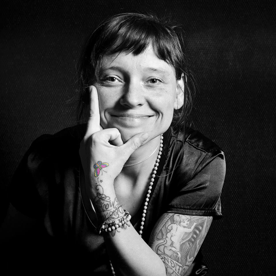
Michaela Thomas is the owner and design director of Butterflies & Hurricanes. She is married, has three children and a BIG dog.
*This is the note Telma Paz—the young designer who was in charge of the graphic deign for our manifesto—wrote after reading this blog post. It shows how, when you find the right people, give them responsibility and trust them, even young designers who are new to the industry can produce amazing results. This is the power of Higher Purpose and Teal organisations.


Comments