Trends 2017, Part 3: Less, But Better
- Feb 16, 2017
- 3 min read

People are living more cramped lives. Cities are more crowded. Living spaces are smaller. Our brains are packed full of endless information. Space and quiet are rare. People feel edgy and want to be calmed. This is feeding consumer desire for less. Less, but better. Better may mean higher quality, it may mean more special, or something more spiritual.
Here is an example of the “less, but better” trend that is reducing materialism: you replace a TV, DVD player, stereo, telephone, camera, drawing table, etc. all by a single laptop computer, or even a mobile phone. This is especially true for millennials.

(Above and below) Designed by Petr Kudlacek, Flashtones is a Czech brand of colourful socks sold singly for mixing and matching. The simple packaging has a hole with no plastic so the colour and texture can be fully experienced. The gold engraving ads specialness. They are also sold in a “mystery pack” like a tissue box for a unique experience and surprise.

To apply this principle to packaging, the idea is more essentialism, than minimalism. Not “less is more”, but only what is essential or necessary, and that made special. Essentialism isn’t new in packaging design, but the added specialness is what makes the trend in that direction different this year.

(Above) Designed by Lavernia & Cienfuegos, this skin cream comes in a an elegant pearl-like container with gold print for added specialness. Again there is only the essential text. See more on The Dieline.
This specialness is a treat that makes shopping for the product worth the effort. Because when a shopper is tired, stressed and in a hurry—as most of us are these days—they want to cut through the visual noise. They want the decision to be made easier, the whole experience to be fluid and effortless. In this way good packaging is performing a service that helps cut through complexity and overcome cognitive overload. This is added value.

(Above and below) Designed by TATABI Studio, Diz-Diz gourmet microwave popcorn takes the experience of microwave popcorn to a whole new level of experience. Again minimal text in that gold print again, and the use of thin and bold print for clarity and emphasis. See more on The Dieline.

The Dieline called this specialness “a premium, glamorised approach to minimalism.” The idea is to stand out by stepping back. To catch attention not by a shout, but by a whisper.

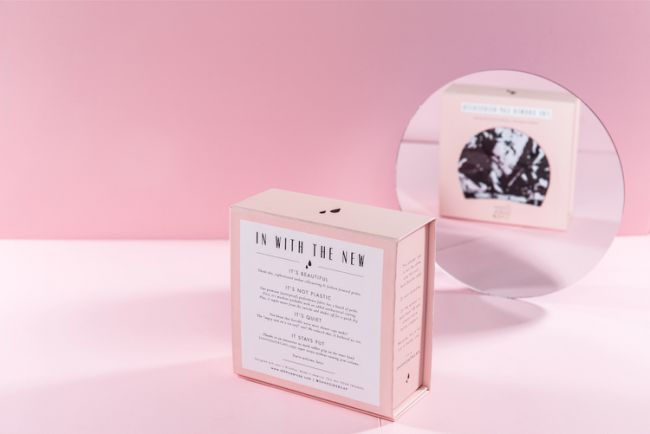
(Above and below) Designed by Jacquelyn De Jesu, to be a shower cap that actually makes you look good instead of having a funny, poofy, ugly plastic bag on your head. "Designed with sass in Brooklyn, New York." See more on The Dieline.

In addition, less packaging means less waste. And more and more consumers are looking for products in as little packaging as possible. Reducing the amount of packaging a customer has to recycle or throw away or find a reuse for, the more the brand will be rewarded.

(Above) Designed by Etiquette in collaboration with Black Swan Brands, to have only essential information on the front and the product types are colour-coded for quickness and clarity. The colour gradient is to represent the transformation the oil can bring. Also note the use of thin and bold print for emphasis and clarity. See more on The Dieline.
The packages above do not completely show the trend of less packaging, which is continuing to grow even though it is tempting for designers to resist it. But packaging designers should not fear this trend of less packaging. They should embrace it. The industry is changing, but the design part will remain. At Butterflies & Hurricanes, we are a packaging design company that is urging our clients to use less packaging. As packaging decreases, we are more and more thinking of branding, as packaging. How do we package the idea, the relationship. This is the Phoenix that will rise from the ashes of traditional packaging design.


Comments